
A painting of orchids, step by step.
I have just completed a new painting of orchids.It is painted in acrylic paints on a wooden board support. It looks like a deep sided canvas, but is actually just wood. It was a nice surface to work on.
Here is a small image of the finished painting, followed by the stages I went through to create it.

Firstly I painted my wooded board a deep pink. It had an old painting underneath, that I no longer wanted. I then did a rough outline of the orchids in white pastel. You can still see a bit of the old painting, through this, but it won't matter!


I then decided to change the background a bit, The light pink was put on to show the direction of the light coming in to the composition. However, I dont think this really worked, so it didn't last long!! I continue to play around with the shades on each flower, and darken the stems and buds.

After this I really build up the contrast on both the background and the flowers. I try to put dark background against pale flowers and vice versa. I still wasn't too happy about the whole thing. In fact, I actually abandoned this for about 3 months before getting back to it. Sometimes that is the best thing to do with a painting, as you re approach it with fresh eyes and fresh ideas.

So after my break I came back and added blue to the background, I left enough of the previous background showing through to not lose all the light and shade though. I use one of my favourite styles, which is a dotty pointillist style. I just love the way it breaks up the colours and adds such vibrancy to the paint surface.

I then work much more in to each individual flower.
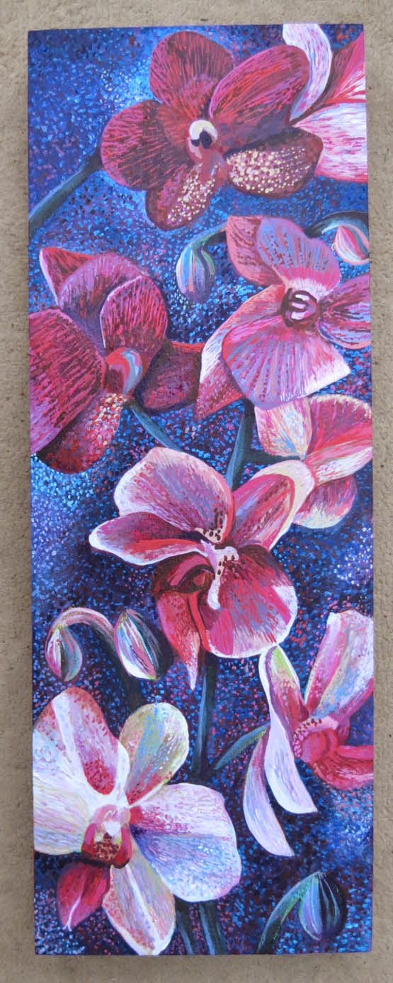
This is the final painting. I have continued to develop each individual flower. I have exaggerated the contrast a bit more, and altered a few individual flower shapes. I have added more of the dotted surface on to the flowers as well as the background.

I have just completed a new painting of orchids.It is painted in acrylic paints on a wooden board support. It looks like a deep sided canvas, but is actually just wood. It was a nice surface to work on.
Here is a small image of the finished painting, followed by the stages I went through to create it.
Firstly I painted my wooded board a deep pink. It had an old painting underneath, that I no longer wanted. I then did a rough outline of the orchids in white pastel. You can still see a bit of the old painting, through this, but it won't matter!
Next I started to add a few basic colours. I have just used diluted acrylic paint. I wanted to separate the flowers from the background.
Following this I worked a bit more paint on to each flower. I wanted this to be about light and contrast as well as the flowers.
After this I really build up the contrast on both the background and the flowers. I try to put dark background against pale flowers and vice versa. I still wasn't too happy about the whole thing. In fact, I actually abandoned this for about 3 months before getting back to it. Sometimes that is the best thing to do with a painting, as you re approach it with fresh eyes and fresh ideas.
So after my break I came back and added blue to the background, I left enough of the previous background showing through to not lose all the light and shade though. I use one of my favourite styles, which is a dotty pointillist style. I just love the way it breaks up the colours and adds such vibrancy to the paint surface.
I then work much more in to each individual flower.


