Showing posts with label Roz Edwards. Show all posts

Tuesday, 1 March 2016

Iris paintings. Same subject, different results!

I have painted several iris paintings in the last few months. I have mostly done small paintings, rather than the large *projects" I have worked on in the past. I am hoping to put together some of my ideas as a book about contemporary floral painting. I have been working on ideas and examples for the book . It will not just be about irises, although they will probably feature quite a lot. They are my favourite flower to paint, due to the complexity and intricacy of the shapes.

So here are a few of my smaller paintings.


This one is a very traditional painting, although I have "cropped" the composition to make it more interesting, creating negative shapes around the edges. I am never keen to have flowers"floating" in the middle of the canvas.  The background is simple, just pale blue and white overlaid dabs of paint.  The flowers themselves, are painted in my typical impressionistic style with many layers of small dots blending to give a subtle range of colours.


Here is the painting framed and ready for sale.

Here is another small painting.


This one is a strong burst of colour!!    I have tried to show how the background is a major part of the painting, and the impact it can have. Imagine the iris on a plain white background. How different would the painting be!!!  I have exaggerated the colour contrasts by making the flower back lit. 


The power of deep colours. There is nothing subtle about the one above. I have made the buds a feature, because they are attractive in their own right. I have concentrated on vertical sections, with the leaves breaking up the background and ribbons of patterning behind the plant.  I have placed darker background areas around the lighter parts of the plant to add to contrast, making them stand out.


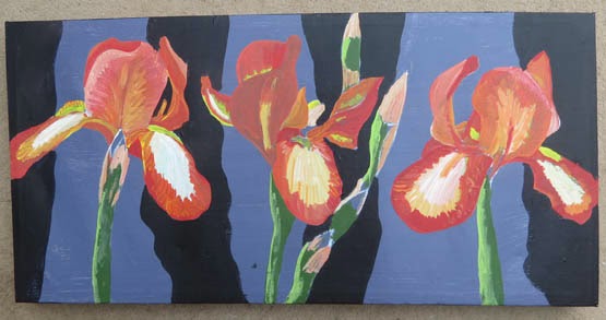
This painting is on a small long thin canvas. Just like the previous one, I have used the vertical format as a feature of the work. I have used dabs of paint for the background and stripes of paint on the iris flowers. This difference makes the paint surface visually interesting, and a feature of the work.


Cool colours here. I have used purple and lilac in the background, as well as the predominate colour for the irises. This is a good technique to link your flower with what is behind it, and give unity, rather than contrast, for a softer effect.  Compare it with the vibrant ones above, and you will see what I mean.

I have several more paintings being worked on at the moment. My studio is full of half done paintings!! I am producing a series of paintings on the theme of trees. These will be put on my other blog "artycraftythings" as I try and keep this blog just about floral art.  there is a link to my other blog on the sidebar of this page.

Wednesday, 22 July 2015

Painting a red rose in acrylic. Step by step

Roses are wonderful flowers to paint. The way the petals overlap and catch the light is fascinating!  I find them quite challenging to capture the depth and solidity of the shape, as well as the delicate, almost transparent, effect of the petals against the light.

I have painted a red rose. 

Here is how I did this painting.

Firstly I made a sketch. This is done using pencil with broad strokes. It is a very rough drawing just to get the feel of the shapes. I have used a thin black pen on some of the edges too.


Next I did a tonal study using thin washes of black paint, followed by more pencil work to define the shapes. I have added a few swirls in the background to indicate how I want the background to look.


Now on to some paint! I am working on thick card, as this painting will go in a frame. I sketched out the main outline shape of the rose first. I have decided to do the background in a soft beige peach colour.


My next stage is to block in all the light and dark areas. I am using acrylic paint. I am using a mixture of different liquid acrylics, mainly Chromacolour, Procolour, Golden and AJ Vallejo. Most of this work is done with medium sized brushes sizes 4 and 6. Some of the smaller shapes are a size 2 brush.
The colours are built up in layers. I put the darkest tones on first, as this helps show the structure. I then add middle tones which gives the rose some form. I then add white highlights. Once I have the three basic tonal areas done, I mix up the "in between" colours and add these over the top.
This is a red rose, but I am using orange, pink, brown and purple as well. This is to break up the surface and make the painting more visually interesting. I would struggle to get enough contrast without a wide range of colours.


My usual painting style is to work in a "sort of" impressionistic way, with lots of small dabs of paint. My paintings are built up of many layers of paint, which give a textured look. I like to make the background an important and integral part of the painting too.

Here are some close up areas of my technique, as I develop this painting.


The final painting,  I have added grey, pale blue and white dots in the background to make swirls.  I have worked in many layers of additional paint dots and lines on top of my initial colours. I have used the paint in different directions, on the petals, to show the way the flower grows.


This will go in to a frame. I will update this post to show you that, when I have framed it. Also I will add in the information where it will be on sale later.


Wednesday, 1 July 2015

A painting of four purple irises. Step by step.

Here is my latest iris painting!!


This is a very bright bold painting, A real splash of summer colour!

I started by drawing the outlines on to a canvas. I never draw in detail, as I do all the detail directly with the paint.


Next I blocked in the background colour and painted the stems. I used a basic level quality acrylic paint.


My next stage was to start working on all the various shades of purple in the iris flowers. I am now using better quality acrylic. Mainly Chromacolour with some AJ Vallejo acrylic gouache and some Golden liquid acrylic.  I have decided to add some leaves to fill up the space at the bottom, and balance the composition.


Next I start working some pattern in to the background. this is a series of dots in swirls. I use yellows, reds, pinks and oranges that compliment the main background colour. I do dots of different sizes, and layer them up.  I have also added some additional detail to the flowers and buds.


 Here is a close up to show a section of the painting.....not yet finished, as you can see.  I have really worked in to the background to show greater contrast.  I still need to complete the purles on the flowers with the final layers of detailing and texture.


The completed painting.


This painting was the one that I used as a demonstration at the Society of Floral Painters exhibition last month.  I promised several people who watched me painting that I would get it on here when completed. So here it is!!! 

The painting will be on sale later in the year, probably at the Windsor contemporary Art Fair. 


Wednesday, 27 May 2015

Paintings of tulips in acrylics.

I have recently completed some paintings of tulips. These have been inspired by the lovely flowers in my garden and from visits to public parks such as RHS Wisley and Regents park in London.  All the work is in acrylic paint.


I did this as a small painting. Initially as a test for a larger painting. However, I ended up completing this one, as I enjoyed doing it so much!   Below is the larger version. I have changed the colours a bit, and the composition is a bit less busy.


The two paintings together, to get a sense of scale.


I also did the one below. This is a backlit study of tulips. The see through quality shows some interesting new shapes within the petals.


My next painting is a group of tulips, These were more white in reality. I really exaggerated the colours to get a more dramatic painting. I am not very good at painting white flowers, as I love big bold colours too much!!


Here are some of the paintings mounted and packed in cellophane ready for sale. I shall also sell these as prints. I may produce them as greetings cards later too.


Some of these are on sale in my Etsy shop  have a look here at affordable prices as I am selling direct to you!!  Others are available at Artfinder. there is a link on the sidebar.

Monday, 20 April 2015

A painting of Parrot Tulips. Step by step.

My latest painting is of four parrot tulips. I have a selection of these attractive vibrant flowers growing in my back garden at the moment. However when I stared the painting they were not in bloom. So I worked from last years photos initially, but was able to take inspiration from the real things as I completed the work.

Here is the finished painting.

Tulips in my back garden.


Here is how I did the painting!!

Working from photographs initially, I drew the outlines in pencil,showing different aspects of the flowers. I am working on canvas. I then coloured the background black. I used System 3 acrylic at this stage.
I then painted in some of the yellow areas on the flowers plus the green stems.

Above are the next two stages of my painting.  I added red and orange areas to the tulips. There is very little detail at this stage, just simple blocks of colour. I am using a size 4 brush for most of this stage.
I then added some stripes of jade green to the background, and started to texture it with blue and black dots.


I then used a mixture of Chromacolour, AJ Vallejo acrylic gouache and Turner acrylic gouache to complete the painting. The entire surface of this painting is impressionistic dots. I had only intended to do this on the background ( a technique I use in many of my paintings! ) but extended it to the flowers too. I like the fact this painting looks so realistic from a distance but breaks up in to blobs of colour as you get close to it.
 I use a range of different reds, oranges and yellows plus areas of pink, purple brown and white to give definition.  I worked with brush sizes 2 to 000 on the dots.

I varnished the painting using a mixture of matte and gloss varnishes. I have found that this gives a lovely semi shine to the work and really enhances the colours. I use varnishes by Golden.


The weather was lovely and sunny so I was able to finish this painting in the garden.


The painting has now been framed. I used a simple black floater frame around the canvas. The painting has a lot of work in it so a simple frame was all that it needed. I am not a fan of fussy or over decorative frames. Most of my canvas work is usually left unframed.

This painting will be entered in to  the Society of Floral Painters exhibition in Chichester 20th May to 7th June.

Thursday, 16 April 2015

Roz Edwards, Floral artist. Recent paintings.

I have painted quite a lot of floral paintings in the last few months. 


However, I have not posted here for awhile so thought I would add some photos of my recent paintings, all in one place!!    Some of them I will add on to this blog as step by step demonstrations, when I have some spare time!!  Some of them are already on the blog...have a look if you missed them first time!!

I will be exhibiting at the annual exhibition of the Society of Floral Painters in less than 2 months time.   The website is available by clicking  here

I will also be at the Floral fringe Fair on May 30 and 31.  The website is here


Sunday, 29 March 2015

Painting Purple Irises, step by step.

I have completed another painting of my favourite flowers, Irises. This time I have looked at big bold dark purple ones.  This is painted in acrylic on canvas, and will be for sale, at an exhibition later in the year.
So here is a sneak preview of the finished painting followed by the stages of painting to create it.


I have worked from photographs, that I took last summer.
My first stage was to draw the outlines. I used a canvas painted red, as I am not keen on working on white backgrounds. I used pencil initially, and then went over the pencil with white acrylic paint using a size 1 brush.


Next I start to fill in some of the background colours for the flowers.


The next two stages show how I develop the detail on the flowers, with layers of acrylic. I have exaggerated light and shade contrasts to make the flowers more visually interesting.  The original photos had very little contrast, and looked fairly flat.  I am using Chromacolour acrylic and AV Vallejo acrylic gouache for the detail. I am using brush size 2 down to 00 at this stage.

I have started to add some oranges, reds and yellows in the background. The yellow is placed under the darkest part of the petals, to make the purple stand out more.


Here is my finished painting, in my studio. I have added masses more detail to the background, so the flowers are surrounded by swirls of hot colours. The background is painted in many layers of dots. This is time consuming but worth the effort, as it adds so much to the depth of the painting. I rarely have a plain background on any of my paintings,


Some close ups to show technique.


Here is another photo of the finished painting.


This is for sale on Artfinder. There is a link on the sidebar.


Thanks for looking. Comments always appreciated.


Friday, 6 March 2015

Painting orange irises step by step

I have painted some of my fave flowers. irises, in lovely shades of orange. 


As usual I shall show you the finished painting, then show you how it all came together, step by step.

 I am enjoying working on long rectangular canvases at the moment, as they give an opportunity to experiment with slightly different composition. Firstly I painted the canvas with a pale grey acrylic. I am never keen to work on white, as regular readers of this blog will know. I then drew my irises on with pencil. This was followed by a thin layer of white acrylic, using a small size 1 brush to outline the flower shapes. I never draw detail...I do it all with the paint.


Next I added some very basic colours to get a feel of the composition and colour balance.


After this I worked a bit more in to the individual flowers. I am using a mixture of Chromacolour paint and acrylic goauche. I am using size 2 and 4 brushes. I have put some bold stripes in the background using Paynes Grey. 


My next area of work is to break up the background with lots ( and lots! ) of dots and blobs. These need to mix together to soften the background. I am using a size 2 and 00 brushes to work in to the flowers. I am adding many layers of different reds, oranges and yellows.


My finished painting. I have removed one of the buds, and continued to work in to the flowers with many small marks. The background has about another million ( !! ) dots on it using shades of grey and deep blues. I have added some red violet in to the irises to increase contrast.


This one will appear at an exhibition later in the year. I have several booked up, but have yet to assign which paintings will go to which events !