Tuesday, 12 August 2014

A floral garden painting. Step by step.

I have just completed a floral garden painting, in acrylics on canvas. This is inspired by the lovely tangles of flowers growing out in my back garden, It was a pleasure to sit outside in the sunshine, and just paint what was there. Sometimes inspiration for a painting is literally just where you are. I usually work from photographs, so this made a nice change.

Here is the finished painting, and below that, step by step, how I created it !


First of all I painted some stripes on my canvas. This was to break up the surface in to sections.It roughly resembles sky and earth...but only just!!!

Next I divided this in to zones. at the top is the sky area and below layers of mud and simple vegetation!!  I appreciate at this stage it may not be too obvious what is going on here!  I added some dots to give texture.

After this I tried to make the background more varied and interesting. I added a garden wall at the back, and a bush, plus some more detail in the foreground vegetation. I am using a range of different acrylic paints as this is just the back of the design. Most of this will get covered up.


Now I add more detail. I have added a few patches of foliage on the mud section in the middle. I have altered the colours a bit over the whole painting. Lots of layers of dots!

Following this, it is time for some foreground plants. I was working outside, so just copied some leaves from a selection of plants in my own back garden. I painted these directly, without drawing the outlines first. I did not want pencil marks ruining the surface. 

Next I put in some simple flower heads, and work some other layers of greens in to the leaves. I am now using better quality acrylic paints, as I come towards the top surfaces of the painting. I am working with a range of brushes from size 1 to 4.

It is now time for greater detail in the flowers. I also add some thin dark green stalks across the whole painting.

Following this, I add some small white flowers to the stalks. You are starting to feel the layered effect of this painting now.

I next add in a layer of bright pink flowers. Again just copied from something growing in-front of me. This is why painting outdoors is so good!!


After this I complete the painting, by adding in some small blue flowers at the front. This balances the blue sky at the top.  I do a few minor changes here and there....and its done!!


I painted the same picture over the sides initially, but changed my mind and painted the sides paynes grey, which is almost black . It was just too fussy with the sides the same as the front!


This is for sale on ArtFinder. Please use the link on the sidebar.

Tuesday, 22 April 2014

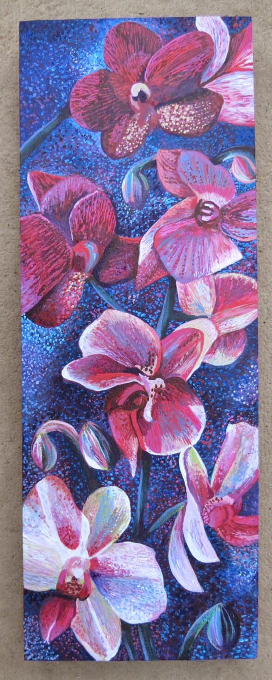
A painting of orchids. Step by step

A painting of orchids, step by step.

I have just completed a new painting of orchids.It is painted in acrylic paints on a wooden board support. It looks like a deep sided canvas, but is actually just wood. It was a nice surface to work on. 

Here is a small image of  the finished painting, followed by the stages I went through to create it. 


Firstly I painted my wooded board a deep pink. It had an old painting underneath, that I no longer wanted. I then did a rough outline of the orchids in white pastel.  You can still see a bit of the old painting, through this, but it won't matter!


Next I started to add a few basic colours. I have just used diluted acrylic paint. I wanted to separate the flowers from the background.


Following this I worked a bit more paint on to each flower. I wanted this to be about light and contrast as well as the flowers.


I then decided to change the background a bit, The light pink was put on to show the direction of the light coming in to the composition. However, I dont think this really worked, so it didn't last long!!   I continue to play around with the shades on each flower, and darken the stems and buds.


After this I really build up the contrast on both the background and the flowers. I try to put dark background against pale flowers and vice versa. I still wasn't too happy about the whole thing. In fact, I actually abandoned this for about 3 months before getting back to it. Sometimes that is the best thing to do with a painting, as you re approach it with fresh eyes and fresh ideas.


So after my break I came back and added blue to the background, I left enough of the previous background showing through to not lose all the light and shade though.  I use one of my favourite styles, which is a dotty pointillist style. I just love the way it breaks up the colours and adds such vibrancy to the paint surface.


I then work much more in to each individual flower.


This is the final painting. I have continued to develop each individual flower. I have exaggerated the contrast a bit more, and altered a few individual flower shapes. I have added more of the dotted surface on to the flowers as well as the background.


Sunday, 20 April 2014

Orange Godetia painting


Here is a painting I did a few years ago.  It is based on some godetia flowers, growing in my garden. The original flowers are mainly pink. I changed them to orange shades, as this painting was always planned to hang in my living room, where orange and yellow colours work best.

It is done in acrylic, and the swirly style, in the background,  is influenced by Van Gogh .


Wednesday, 16 April 2014

Acrylic painting of 4 Irises. Step by step.

I have just completed a new painting. Yet again I have used irises as the subject matter!! I really do love painting irises!

Here is the finished painting, followed by step by step how I created it.


I have painted this in my favourite medium which is acrylics. I stared with regular acrylic and added detail with Chromacolour acrylic, as I progressed through the work. It is painted on canvas.

Firstly I drew a really rough outline of where I wanted the flowers to go. I like the cropped effect of them going over the edge. it breaks the background up into interesting shapes.

This was painted over a painting I gave up on. Hence the messy white paint background I used to cover the old one up. 

Next I isolated the flowers by painting a strong turquoise background. At this stage I am not sure if this will work as the final colour...but hey, it will do for now!


The next stage was to start painting in the flowers. I have done a lot of purple irises in other paintings, so was keen to try something different this time. I rarely use yellowy tones as I cannot get the contrast I get with deeper colours. So orange, red and brown would be needed to give definition and shade.


Following this I started working into the other 3 flowers...and yes, I have gone back to my favourite purple and white!!


I then added more foliage, and some buds. I also started to break the turquoise background up with a few other shades.  At this point I have decided to keep this sort of colour scheme for the background, but need to avoid it being flat.


Following this I work some contrast in to the flowers, especially the yellow one. I add dabs of paint to give some interest to the background. The swirly pattern also leads your eye around the painting.


My next stage is to add dark contrast areas to the yellow iris. Also to work a bit on the buds and stems.

I then deepen all the shading on the swirls in the background. I also work some fine details in to all the petals. On the yellow iris I introduce some lime green, and on the purple irises, some blue.


It is almost finished. I work in some smaller dabs of colour on the stems and buds. I put more white on to the purple irises. I do not want this to become too realistic. I want the pattern of the paint strokes to stylize the painting. I have to be careful not to over work it!!


At last the finished painting!!  A bit more contrast here and there. A bit more subtle change of colour work...and its done!!


This will be up for sale soon as prints, cards..... and at some point the original too. 

I will update this blog post with links to where you can buy the items .

Wednesday, 26 March 2014

A picture of an Iris, using paint and pencil crayon

I have just completed a picture of an Iris using mixed media. I used acrylic paint and pencil crayons. 

I used to use pencil crayons a lot but found they did not give the depth of colour I was looking for, or sharp enough contrasts.

My solution has been to do an under-painting in acrylic.  I use Chromacolour which is a very dense liquid paint. You can use it watered down to make a watercolour, or glazed effect too.

I used several different pencil crayons. However, they were mainly Caran Dache and Inktense, both crayons you can use wet or dry. I used both methods in the painting. Sometimes starting as a dry layer and adding water with a thin brush afterwards. Sometimes I just put the crayon in the water and used it wet. I then softened the edges with a brush.

So my first layer was paint, followed by shading and detailing over the top with pencil crayon. At the end I went back, here and there, with some more paint over the top. This was mainly white and pale yellow paint to increase areas of highlight.

The background is rough textured shading as a contrast to the flower.


I am quite pleased with the result, as I haven't used this method for awhile. I will probably improve as I practise the techniques..but, hey, you've got to start somewhere with art and its always great to watch your progress!

This may end up as a card design or a print. I may even sell the original !  Whatever I decide I will update here on the end of this posting.

Saturday, 8 March 2014

Painting of Gladioli

Here is a recent painting, of Gladioli.  It was based on a photo I took last summer. It was taken in the evening when the plant was back-lit, showing off its colours to advantage.

I have done this as a mixed media work. most of it is acrylic paint, but I have added a final layer of detail with pencil crayon.


I shall update this here when this is available as prints and greetings cards.

Wednesday, 19 February 2014

Painting Irises, in acrylics, step by step

This is how I painted a detailed picture of irises.

This article appeared first on my other blog, artycraftythings. It is one of the most popular posts, so I thought I would recreate it on here too! 

I will show you the finished painting  first, and then take you through the stages of the painting.


Firstly I painted some stripes of  blues , greens and purples. I rarely work directly on a white canvas, I needed something to break it up!! These are the sorts of colours I had in mind for my final piece. I knew the design would be based around vertical lines.  I am using acrylic paint.


I then painted some freehand flowers. These are very crude and simplistic, but gave me a rough idea of the look I was after. You can see I have already changed the colour of the stripes!


Next I sketched on a more detailed iris over the top. I painted it white, so I could just see my drawing through it. I then drew the detail back in again over the top!  This may seem like a fussy way of working, but I find it effective and it enables me to build my painting up in layers,


I then did this again with some other irises. You can see I have started to add detail to the first one I put on. The initial freehand irises are becoming background features!  On the second photo you can see I painted one of the irises orange instead of white. This was simply so I could see it clearly against the one it was in front of.


After this I worked in to some of the flowers, and have experimented a bit with an area of background.  I am also adding a few more greens to the leaves. I have painted out some of the initial background irises.


Next, I decided to add another layer of irises. Rather than full flowers I added mainly buds. I thought this gave contrast, and made it more naturalistic. You rarely get perfect flowers all in the same place at the same time! Also the buds were interesting to paint!


Following this I then concentrated on adding detail to all the flowers.


Now I am working in to the background. I love the negative shapes between the flowers. In all my paintings the background is important. I never paint a flat plain background!!  I enjoy all the swirls and dabs of paint that tie the whole composition together.


Next  I added some more buds in the right hand corner. I thought this space looked too empty. As you can see I played around with this idea for a while, but removed some of  it, as it did not work out!!   You can also see how I changed the background quite a lot. I wanted a high contrast in the background , with light and dark areas, created from small dabs of paint. I have also continued to detail up my flowers.


Finally the painting is finished. I have adjusted some of the colours a bit, and tidied it up here and there!


This painting will eventually be sold. I like it, so I am hanging on to it for a while longer!!

I shall  produce it as greetings cards and prints first. When these become available I shall update this blog post with the details here....