Showing posts with label Irises. Show all posts

Tuesday, 1 March 2016

Iris paintings. Same subject, different results!

I have painted several iris paintings in the last few months. I have mostly done small paintings, rather than the large *projects" I have worked on in the past. I am hoping to put together some of my ideas as a book about contemporary floral painting. I have been working on ideas and examples for the book . It will not just be about irises, although they will probably feature quite a lot. They are my favourite flower to paint, due to the complexity and intricacy of the shapes.

So here are a few of my smaller paintings.


This one is a very traditional painting, although I have "cropped" the composition to make it more interesting, creating negative shapes around the edges. I am never keen to have flowers"floating" in the middle of the canvas.  The background is simple, just pale blue and white overlaid dabs of paint.  The flowers themselves, are painted in my typical impressionistic style with many layers of small dots blending to give a subtle range of colours.


Here is the painting framed and ready for sale.

Here is another small painting.


This one is a strong burst of colour!!    I have tried to show how the background is a major part of the painting, and the impact it can have. Imagine the iris on a plain white background. How different would the painting be!!!  I have exaggerated the colour contrasts by making the flower back lit. 


The power of deep colours. There is nothing subtle about the one above. I have made the buds a feature, because they are attractive in their own right. I have concentrated on vertical sections, with the leaves breaking up the background and ribbons of patterning behind the plant.  I have placed darker background areas around the lighter parts of the plant to add to contrast, making them stand out.


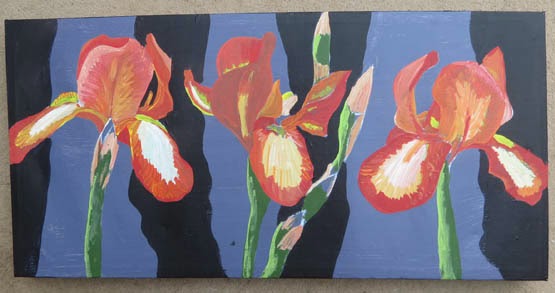
This painting is on a small long thin canvas. Just like the previous one, I have used the vertical format as a feature of the work. I have used dabs of paint for the background and stripes of paint on the iris flowers. This difference makes the paint surface visually interesting, and a feature of the work.


Cool colours here. I have used purple and lilac in the background, as well as the predominate colour for the irises. This is a good technique to link your flower with what is behind it, and give unity, rather than contrast, for a softer effect.  Compare it with the vibrant ones above, and you will see what I mean.

I have several more paintings being worked on at the moment. My studio is full of half done paintings!! I am producing a series of paintings on the theme of trees. These will be put on my other blog "artycraftythings" as I try and keep this blog just about floral art.  there is a link to my other blog on the sidebar of this page.

Wednesday, 1 July 2015

A painting of four purple irises. Step by step.

Here is my latest iris painting!!


This is a very bright bold painting, A real splash of summer colour!

I started by drawing the outlines on to a canvas. I never draw in detail, as I do all the detail directly with the paint.


Next I blocked in the background colour and painted the stems. I used a basic level quality acrylic paint.


My next stage was to start working on all the various shades of purple in the iris flowers. I am now using better quality acrylic. Mainly Chromacolour with some AJ Vallejo acrylic gouache and some Golden liquid acrylic.  I have decided to add some leaves to fill up the space at the bottom, and balance the composition.


Next I start working some pattern in to the background. this is a series of dots in swirls. I use yellows, reds, pinks and oranges that compliment the main background colour. I do dots of different sizes, and layer them up.  I have also added some additional detail to the flowers and buds.


 Here is a close up to show a section of the painting.....not yet finished, as you can see.  I have really worked in to the background to show greater contrast.  I still need to complete the purles on the flowers with the final layers of detailing and texture.


The completed painting.


This painting was the one that I used as a demonstration at the Society of Floral Painters exhibition last month.  I promised several people who watched me painting that I would get it on here when completed. So here it is!!! 

The painting will be on sale later in the year, probably at the Windsor contemporary Art Fair. 


Sunday, 29 March 2015

Painting Purple Irises, step by step.

I have completed another painting of my favourite flowers, Irises. This time I have looked at big bold dark purple ones.  This is painted in acrylic on canvas, and will be for sale, at an exhibition later in the year.
So here is a sneak preview of the finished painting followed by the stages of painting to create it.


I have worked from photographs, that I took last summer.
My first stage was to draw the outlines. I used a canvas painted red, as I am not keen on working on white backgrounds. I used pencil initially, and then went over the pencil with white acrylic paint using a size 1 brush.


Next I start to fill in some of the background colours for the flowers.


The next two stages show how I develop the detail on the flowers, with layers of acrylic. I have exaggerated light and shade contrasts to make the flowers more visually interesting.  The original photos had very little contrast, and looked fairly flat.  I am using Chromacolour acrylic and AV Vallejo acrylic gouache for the detail. I am using brush size 2 down to 00 at this stage.

I have started to add some oranges, reds and yellows in the background. The yellow is placed under the darkest part of the petals, to make the purple stand out more.


Here is my finished painting, in my studio. I have added masses more detail to the background, so the flowers are surrounded by swirls of hot colours. The background is painted in many layers of dots. This is time consuming but worth the effort, as it adds so much to the depth of the painting. I rarely have a plain background on any of my paintings,


Some close ups to show technique.


Here is another photo of the finished painting.


This is for sale on Artfinder. There is a link on the sidebar.


Thanks for looking. Comments always appreciated.


Friday, 6 March 2015

Painting orange irises step by step

I have painted some of my fave flowers. irises, in lovely shades of orange. 


As usual I shall show you the finished painting, then show you how it all came together, step by step.

 I am enjoying working on long rectangular canvases at the moment, as they give an opportunity to experiment with slightly different composition. Firstly I painted the canvas with a pale grey acrylic. I am never keen to work on white, as regular readers of this blog will know. I then drew my irises on with pencil. This was followed by a thin layer of white acrylic, using a small size 1 brush to outline the flower shapes. I never draw detail...I do it all with the paint.


Next I added some very basic colours to get a feel of the composition and colour balance.


After this I worked a bit more in to the individual flowers. I am using a mixture of Chromacolour paint and acrylic goauche. I am using size 2 and 4 brushes. I have put some bold stripes in the background using Paynes Grey. 


My next area of work is to break up the background with lots ( and lots! ) of dots and blobs. These need to mix together to soften the background. I am using a size 2 and 00 brushes to work in to the flowers. I am adding many layers of different reds, oranges and yellows.


My finished painting. I have removed one of the buds, and continued to work in to the flowers with many small marks. The background has about another million ( !! ) dots on it using shades of grey and deep blues. I have added some red violet in to the irises to increase contrast.


This one will appear at an exhibition later in the year. I have several booked up, but have yet to assign which paintings will go to which events !

Tuesday, 9 December 2014

A painting of 3 irises in acrylic

My latest iris painting has been featured on Jacksons Art blog.


If you want to read how I did this painting, step by step please click on  THIS LINK  to view.

I have shared my art with Jacksons in the hope I will get some new regular readers to my blog.  I bought the paints I used for this painting from them.  I use AV Vallejo acrylic gouache, which is a lovely new paint I discovered earlier in the year. Prior to that most of my paintings were done in Chromacolour. However, I felt a need to try something different. I will probably mix the two types of paint together on my next painting, to see how that works. They are both acrylic based paints, so it should work well.

I have several new paintings on the go at the moment, so will post again on here as soon as they become completed.

Saturday, 11 October 2014

A large close up painting of an Iris. Step by step

I have just finished doing this iris painting.  I have used a selection of acrylic paints, to build it up in layers.

I will show a larger pic at the end of the blog, after the step by step bit...!


I wanted to do a really detailed close up, but still in my usual "dotty" style.

I love the look of back lit flowers, so decided to do it in that style. I am drawn to  the dramatic contrasts you get with the light and dark.


I drew a rough outline on to the canvas. in pencil.


I then filled in the background with Prussian Blue, and put a few areas of lighter, washed out blues on to the flower, just to define the shapes.


I have now put a thin wash of all the main colour areas. However, at this stage I have not really worked much in to detail and contrast.


I am now really looking closely at the areas of individual colour, plus light and shade.  I have started to really layer up the paint, working in small dabs and dots.


I continue to add small detail and to refine the previous work. I have changed the background colour a bit too.


The final painting.  I have added some dark swirls of dots in to the background. I have built up the detail all over.

I am fairly pleased with this one, and shall do some more in this style.

This painting is now for sale in my Etsy shop for a few months.  Have a look HERE

If it does not sell on Etsy it will go to a gallery....but remember I have to double the price in a gallery as they take 50% commission.   This is why I regularly try and sell my paintings online first to give people a chance to own them at a fair and affordable price.

Wednesday, 16 April 2014

Acrylic painting of 4 Irises. Step by step.

I have just completed a new painting. Yet again I have used irises as the subject matter!! I really do love painting irises!

Here is the finished painting, followed by step by step how I created it.


I have painted this in my favourite medium which is acrylics. I stared with regular acrylic and added detail with Chromacolour acrylic, as I progressed through the work. It is painted on canvas.

Firstly I drew a really rough outline of where I wanted the flowers to go. I like the cropped effect of them going over the edge. it breaks the background up into interesting shapes.

This was painted over a painting I gave up on. Hence the messy white paint background I used to cover the old one up. 

Next I isolated the flowers by painting a strong turquoise background. At this stage I am not sure if this will work as the final colour...but hey, it will do for now!


The next stage was to start painting in the flowers. I have done a lot of purple irises in other paintings, so was keen to try something different this time. I rarely use yellowy tones as I cannot get the contrast I get with deeper colours. So orange, red and brown would be needed to give definition and shade.


Following this I started working into the other 3 flowers...and yes, I have gone back to my favourite purple and white!!


I then added more foliage, and some buds. I also started to break the turquoise background up with a few other shades.  At this point I have decided to keep this sort of colour scheme for the background, but need to avoid it being flat.


Following this I work some contrast in to the flowers, especially the yellow one. I add dabs of paint to give some interest to the background. The swirly pattern also leads your eye around the painting.


My next stage is to add dark contrast areas to the yellow iris. Also to work a bit on the buds and stems.

I then deepen all the shading on the swirls in the background. I also work some fine details in to all the petals. On the yellow iris I introduce some lime green, and on the purple irises, some blue.


It is almost finished. I work in some smaller dabs of colour on the stems and buds. I put more white on to the purple irises. I do not want this to become too realistic. I want the pattern of the paint strokes to stylize the painting. I have to be careful not to over work it!!


At last the finished painting!!  A bit more contrast here and there. A bit more subtle change of colour work...and its done!!


This will be up for sale soon as prints, cards..... and at some point the original too. 

I will update this blog post with links to where you can buy the items .

Wednesday, 26 March 2014

A picture of an Iris, using paint and pencil crayon

I have just completed a picture of an Iris using mixed media. I used acrylic paint and pencil crayons. 

I used to use pencil crayons a lot but found they did not give the depth of colour I was looking for, or sharp enough contrasts.

My solution has been to do an under-painting in acrylic.  I use Chromacolour which is a very dense liquid paint. You can use it watered down to make a watercolour, or glazed effect too.

I used several different pencil crayons. However, they were mainly Caran Dache and Inktense, both crayons you can use wet or dry. I used both methods in the painting. Sometimes starting as a dry layer and adding water with a thin brush afterwards. Sometimes I just put the crayon in the water and used it wet. I then softened the edges with a brush.

So my first layer was paint, followed by shading and detailing over the top with pencil crayon. At the end I went back, here and there, with some more paint over the top. This was mainly white and pale yellow paint to increase areas of highlight.

The background is rough textured shading as a contrast to the flower.


I am quite pleased with the result, as I haven't used this method for awhile. I will probably improve as I practise the techniques..but, hey, you've got to start somewhere with art and its always great to watch your progress!

This may end up as a card design or a print. I may even sell the original !  Whatever I decide I will update here on the end of this posting.

Wednesday, 19 February 2014

Painting Irises, in acrylics, step by step

This is how I painted a detailed picture of irises.

This article appeared first on my other blog, artycraftythings. It is one of the most popular posts, so I thought I would recreate it on here too! 

I will show you the finished painting  first, and then take you through the stages of the painting.


Firstly I painted some stripes of  blues , greens and purples. I rarely work directly on a white canvas, I needed something to break it up!! These are the sorts of colours I had in mind for my final piece. I knew the design would be based around vertical lines.  I am using acrylic paint.


I then painted some freehand flowers. These are very crude and simplistic, but gave me a rough idea of the look I was after. You can see I have already changed the colour of the stripes!


Next I sketched on a more detailed iris over the top. I painted it white, so I could just see my drawing through it. I then drew the detail back in again over the top!  This may seem like a fussy way of working, but I find it effective and it enables me to build my painting up in layers,


I then did this again with some other irises. You can see I have started to add detail to the first one I put on. The initial freehand irises are becoming background features!  On the second photo you can see I painted one of the irises orange instead of white. This was simply so I could see it clearly against the one it was in front of.


After this I worked in to some of the flowers, and have experimented a bit with an area of background.  I am also adding a few more greens to the leaves. I have painted out some of the initial background irises.


Next, I decided to add another layer of irises. Rather than full flowers I added mainly buds. I thought this gave contrast, and made it more naturalistic. You rarely get perfect flowers all in the same place at the same time! Also the buds were interesting to paint!


Following this I then concentrated on adding detail to all the flowers.


Now I am working in to the background. I love the negative shapes between the flowers. In all my paintings the background is important. I never paint a flat plain background!!  I enjoy all the swirls and dabs of paint that tie the whole composition together.


Next  I added some more buds in the right hand corner. I thought this space looked too empty. As you can see I played around with this idea for a while, but removed some of  it, as it did not work out!!   You can also see how I changed the background quite a lot. I wanted a high contrast in the background , with light and dark areas, created from small dabs of paint. I have also continued to detail up my flowers.


Finally the painting is finished. I have adjusted some of the colours a bit, and tidied it up here and there!


This painting will eventually be sold. I like it, so I am hanging on to it for a while longer!!

I shall  produce it as greetings cards and prints first. When these become available I shall update this blog post with the details here....